Events registration and Salesforce
Overview
We wanted to learn more about our prospective students and provide specific communication to them based on their interest. In order to collect their interests, we needed to encourage them to create an account within our Salesforce community. However, we did not want to further complicate their application journey by introducing yet another platform. We realized quickly that the implementation of the Salesforce community needed to appear naturally within the prospective students overall web journey.
Process
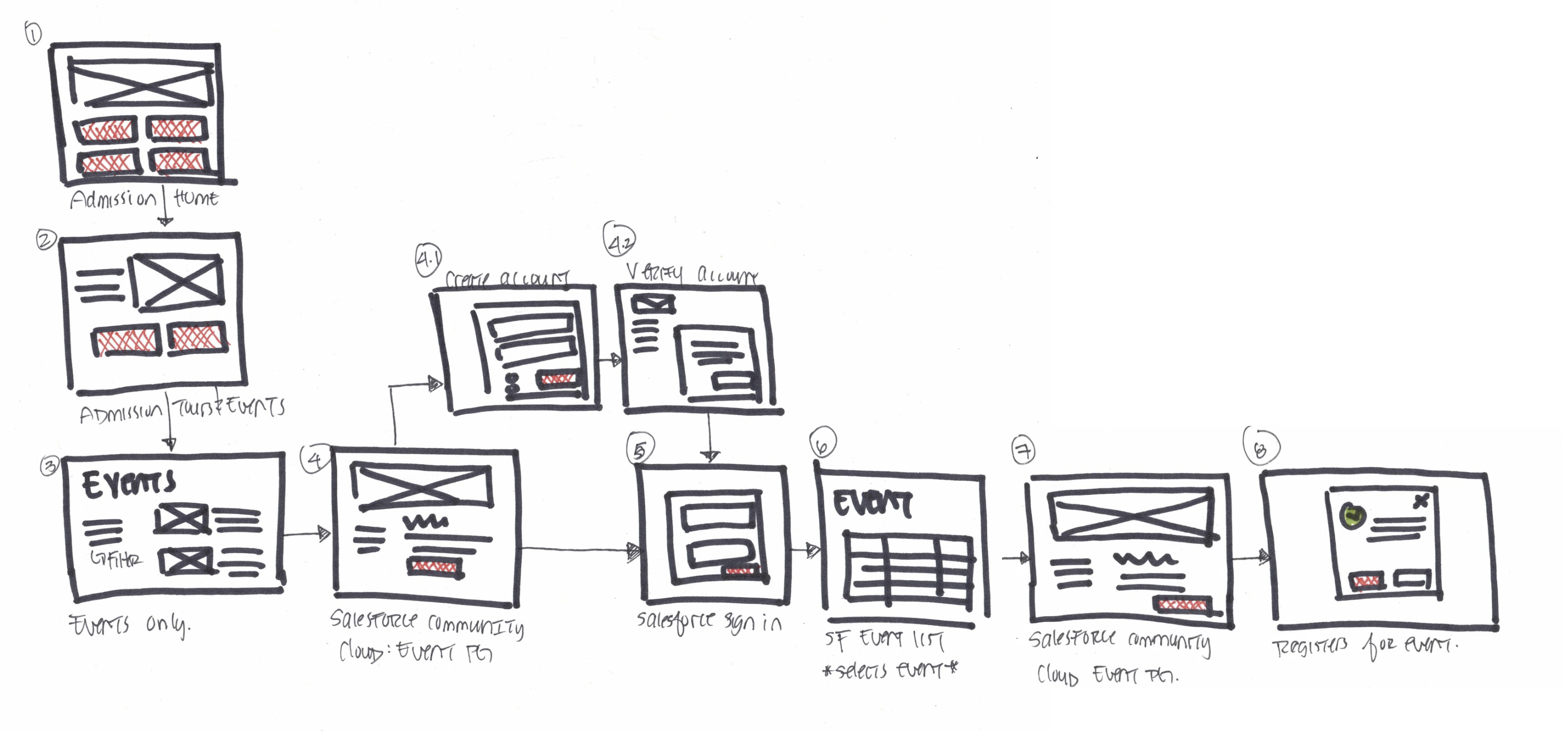
I conducted a content audit and analyzed the overall landscape, I quickly understood the complexity of the application process that a prospective student experiences. From browsing programs, starting the application and then accepting an offer, a prospective student must interact with three very separate looking platforms during the entirety of their application process. I also interviewed our recruiters who shared with me the mental load of a typical high school applicant and some of their concerns with entering adult life.
I also illustrated a low fidelity work flow, so that I can demonstrate to our stakeholders some of the obstacles our students experience.
I furthered my research by analyzing other similar websites and discovered useful ways to integrate the Salesforce community.

Some takeaways that made their integration successful were:
- The UI from browsing from the website to the community was exactly the same
- The main menu navigation did not change from website to community
- Language and tone were the same
Seamless integration
We wanted to integrate the community in a seamless way. In addition to using salesforce to get students to “stay connected” and sign up for our newsletters, I also recommended that we use it as an event registration tool.
Browsing for the events needed to be a pleasant and seamless experience. We needed to decide when we should direct students to the Salesforce community. There were 2 main options:
- A student can browse and register for events in salesforce
- A student can browse events on our website and then register for events in salesforce
What I did
As the UX/UI designer on the sprint team, I liaised on behalf of the business units and developers. Together, we decided that students should browse the events on the website before exiting to create an account and register for events in Salesforce.
While event browsing was available within the Salesforce community, the UI was lacking and underwhelming.
The UI of our website was modern, flexible and easier to customize. I wanted to ensure that the prospective students’ event browsing experience was pleasant, easy and that no obstacles would be present.
Iterate, iterate, iterate
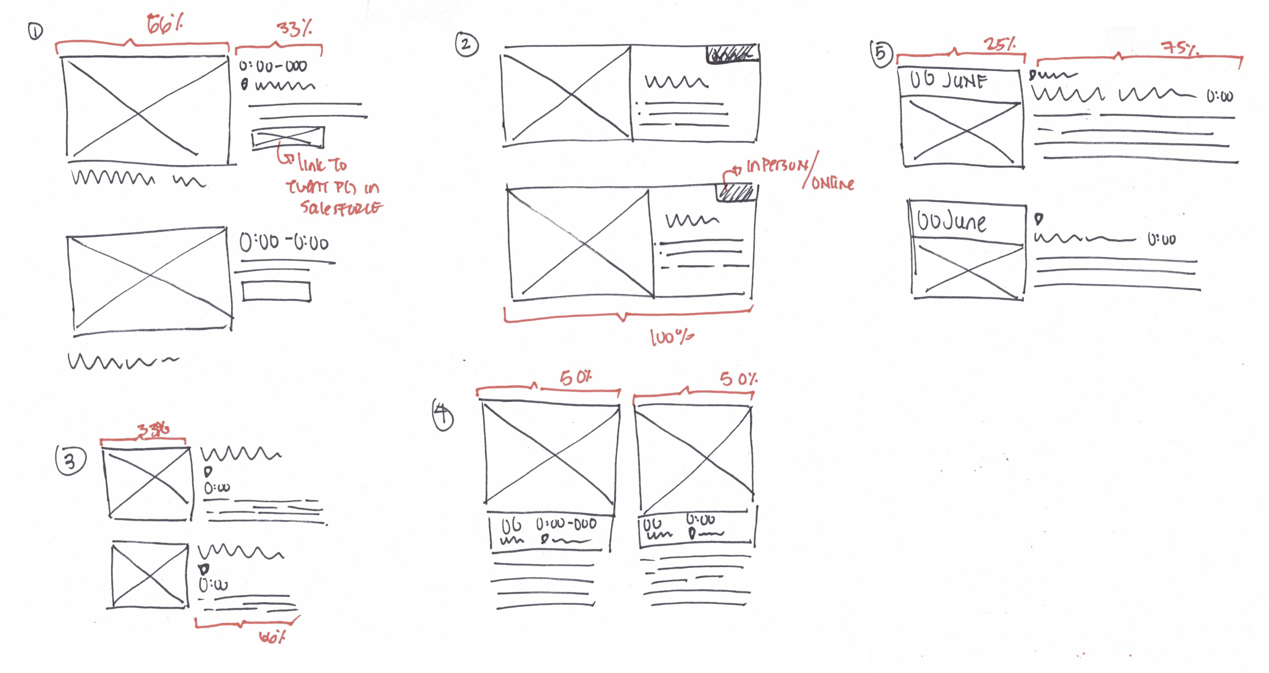
With the understanding that the event browsing experience needed to be pleasant to use, I proposed various custom list designs to our stakeholders. There were 5 critical items that the event list must provide:
- Placeholder for an image
- Brief description of the event
- Easily identify event type (online or in person)
- Option to link to a page with more details or link directly to Saleforce community
- Filter option
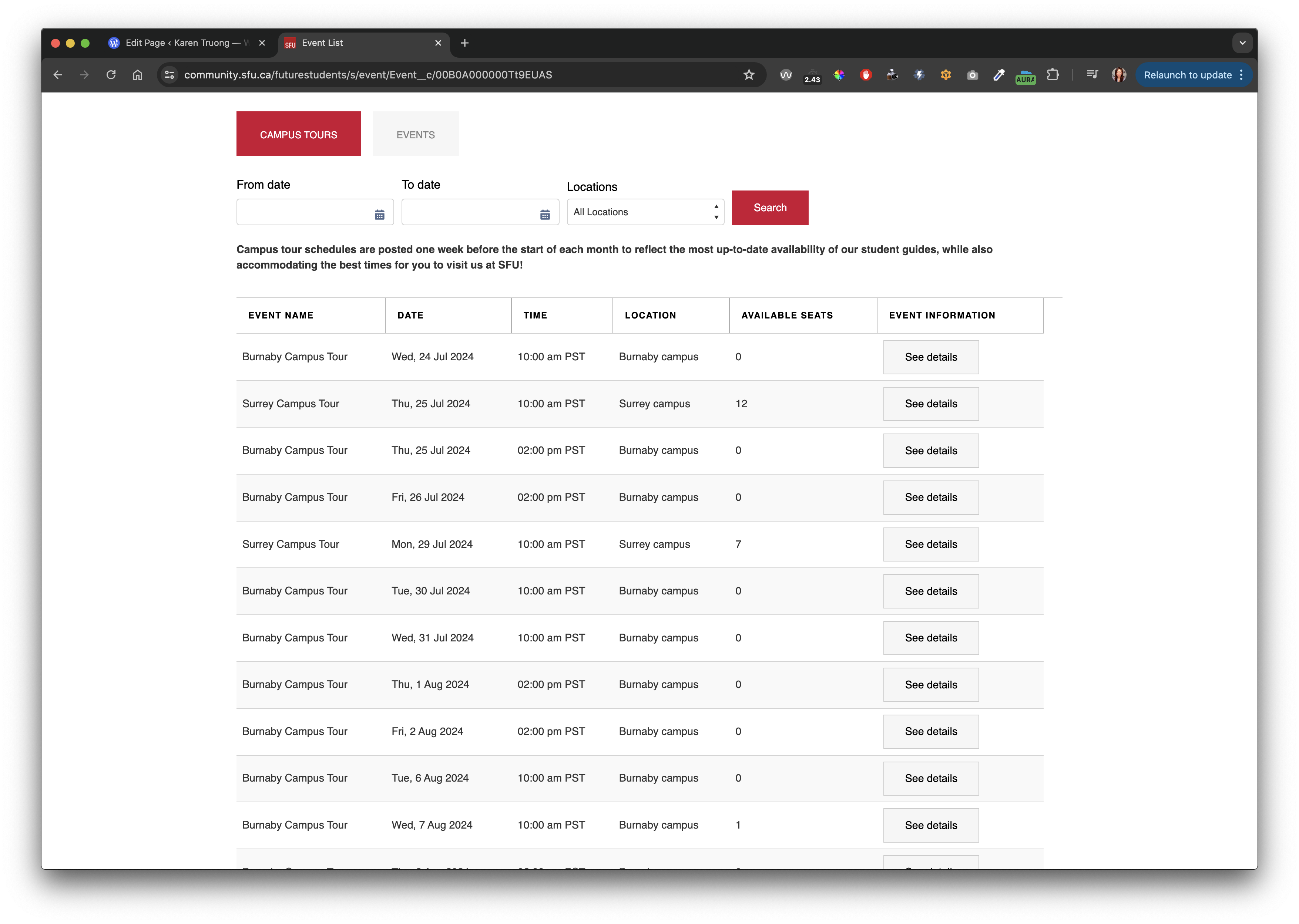
Table view
This option was already available within our Content Management System. While this was visually pleasing, it did not provide the marketing team an opportunity to provide a brief description. Often the event name was not descriptive enough.
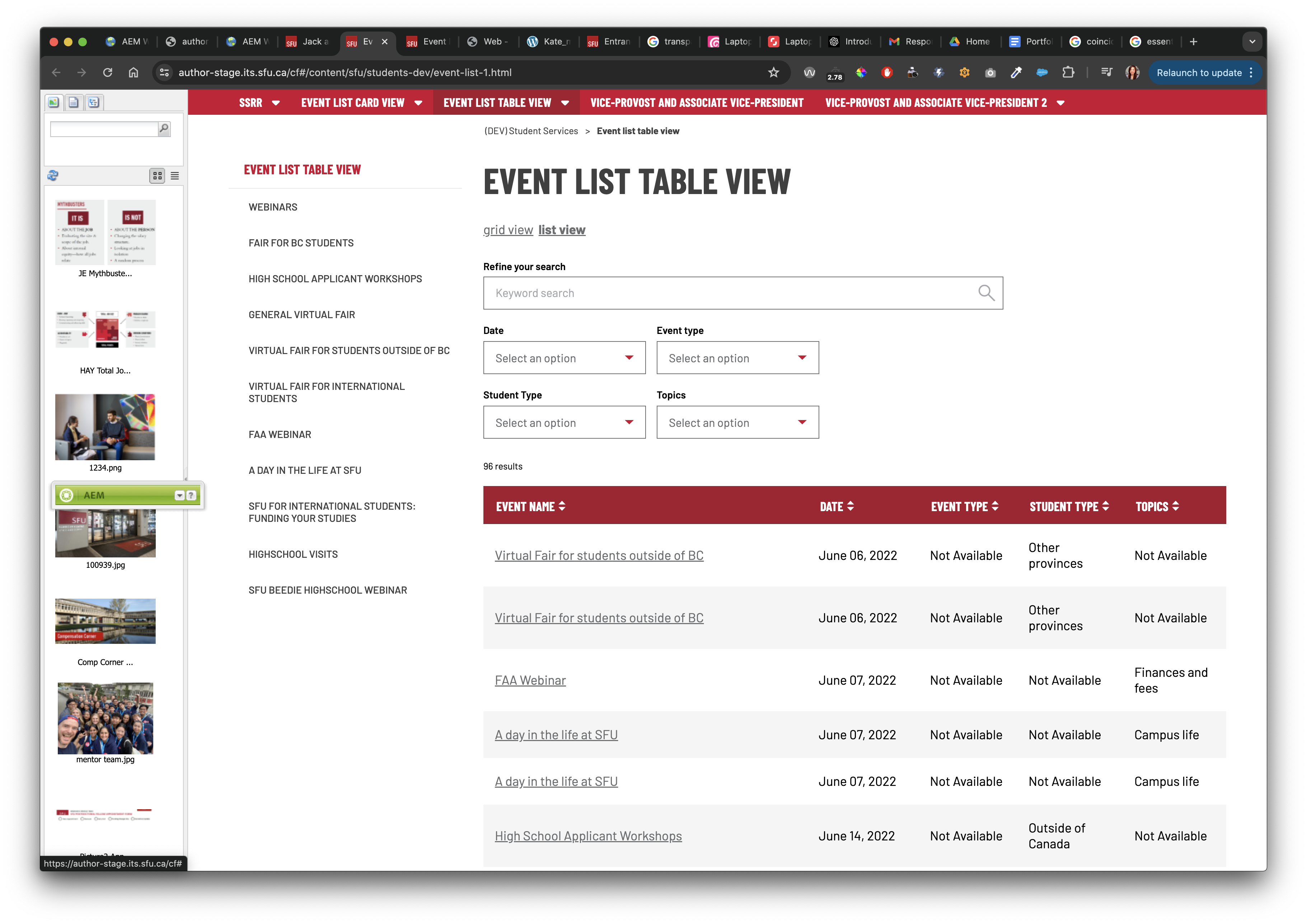
Card sorting view
This option was also available within the CMS and provided users the ability to sort and filter all events with ease. However, images could not be included in this view.

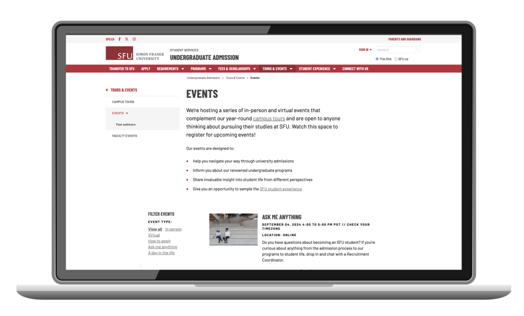
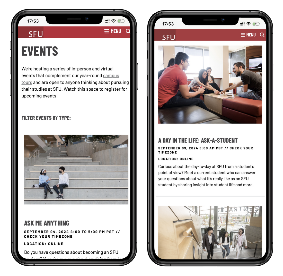
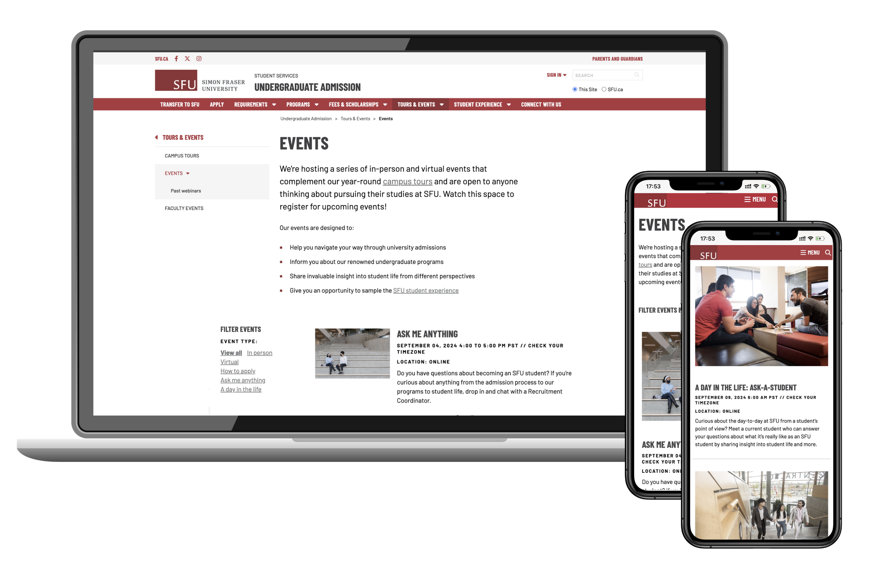
Custom list view
It was clear that a custom developed list was necessary. I researched and analyzed other list views on competitors’ websites and created low fidelity mockups to brainstorm a few list view options.
Results
I successfully designed and developed a custom list view which was well received by our recruiters. This custom list view included a filter option, was responsive and linked the student directly to the corresponding Salesforce event page where they had to create an account and register for the event. It was a seamless user experience but also allowed the recruitment team to collect valuable information about the prospective students. Our marketing team was able to proceed with their email marketing in a more effective manner based on the data collected from the account creation phase.
Learning outcomes
The custom list view required more effort from our marketing team to create and maintain. For instance, they needed to manually link each event to each individual Salesforce event page and ensure that the images, language and tone used from the website and salesforce was the same. This was critical for establishing a seamless end user experience. However, there may be timing constraints and a lack of resources so maintenance of the custom list view was cumbersome.
I organized a retrospective meeting with our recruitment team and discussed improvements to our next iteration. Fortunately, recruitment happens every year so we can continue to refine the details and to improve the maintenance of the custom list without compromising the user’s experience.
