Creating an intuitive navigation
The problem
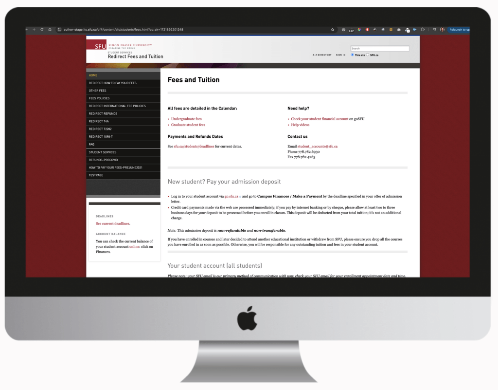
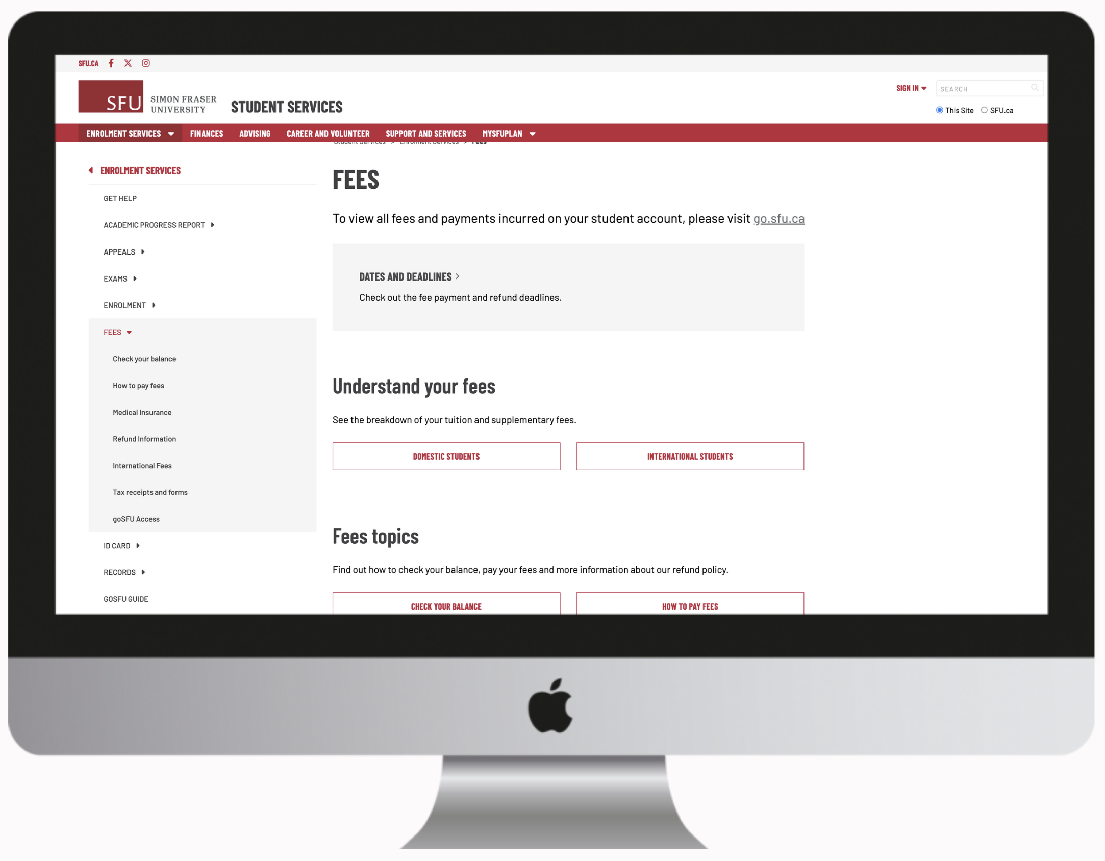
Students struggled to find basic services on our websites. Replacing a lost ID card or figuring out when and how to pay tuition fees is often difficult to find. We offer many services to our students, but over complicate the navigation by organizing all the services into micro sites.
Some of our basic services are dismantled across 15 different websites with each website being managed by a different units. Often, students would find themselves in an infinite loop and being linked from one to page to another when looking for simple services like downloading an advising transcript. Units did not have an overview of what other units were providing, language and tone varied and this complicated the students web experience.

Site map testing
I knew that we needed to centralize the 15 websites under one easy to find location. But it was critical that the menu labels resonated with the students. After completing an in depth audit of all 15 sites, I was able to architect a site map.
Having developed an initial site map, I used Treejack to facilitate my site map test with our students. They were asked to complete a series of tasks and to identify where in the site map they would find this information.
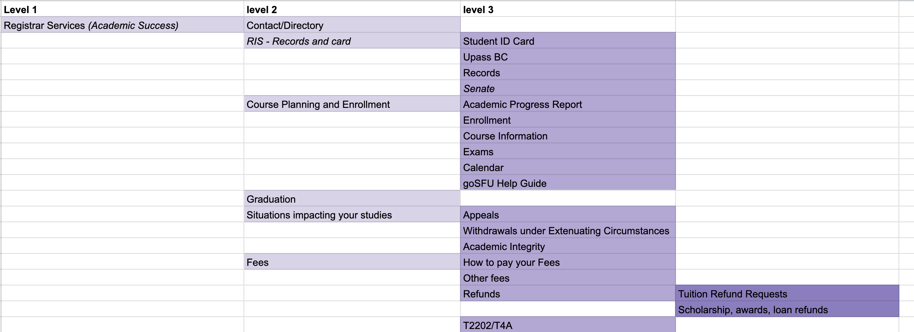
Some tasks included:
- You’ve misplaced your ID card and would like to find out how you can get a new one. Where would you find this information?
- You just received your enrollment appointment and would like to find out how to register for your courses. Where would you find this information?
- You want to get on a payment plan and would like to find out when your tuition is due. Where would you find this information?
Main findings
Websites have historically been organized according to business units as opposed to students needs. Combining all the units under one easy to find location required a little convincing with our stakeholders. We wanted to test the effectiveness of organizing content based on units and the data we collected would help us demonstrate the difficulty of completing a task
Some of the main findings were:
- Students struggle most with locating “money” related topics. When students were asked to find tuition deadlines, 80% failed while 20% indirectly succeeded. This resulted in a score of 1/10.
- When students were asked to find where to find information on replacing their ID card, 45% failed while 55% indirectly succeeded. This resulted in a score of 3/10


Refining the site map and next steps
With these findings, I was able to make recommendations, refine the labels and reconfigure the site map. With a more developed and intuitive site map, I was able to confidently move into the wireframing stage.
Consolidating all 15 micro sites meant that I needed to design several templates and layouts that can be scalable for a variety of purposes. Some of the factors that I considered when designing these templates were:
- Most information is static while a few needs to be updated and be presented in a timely manner.
- Students arrive on our pages in various ways including email, google or our main Student Services page.
- A student who may be interested in one topic may be interested in others. For example: if a student is looking at how to make payments they may want to learn about financial support options as well.
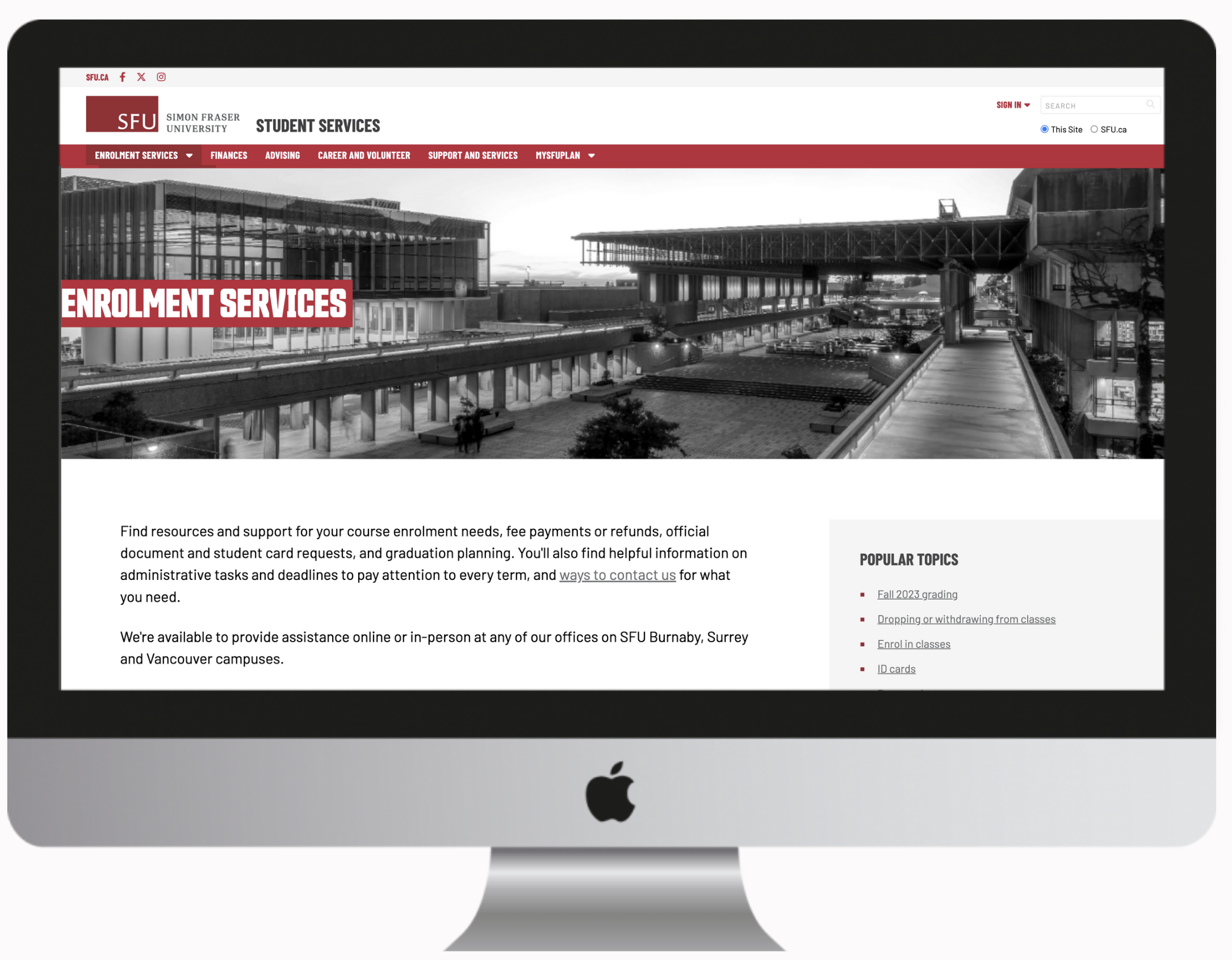
Building the site and further improvements
I designed and built the 15 sites by splitting it into 6 phases over a 6 month period. I included the business units at each phase and worked closely with them to refine and ensure that the website was optimal for our students.
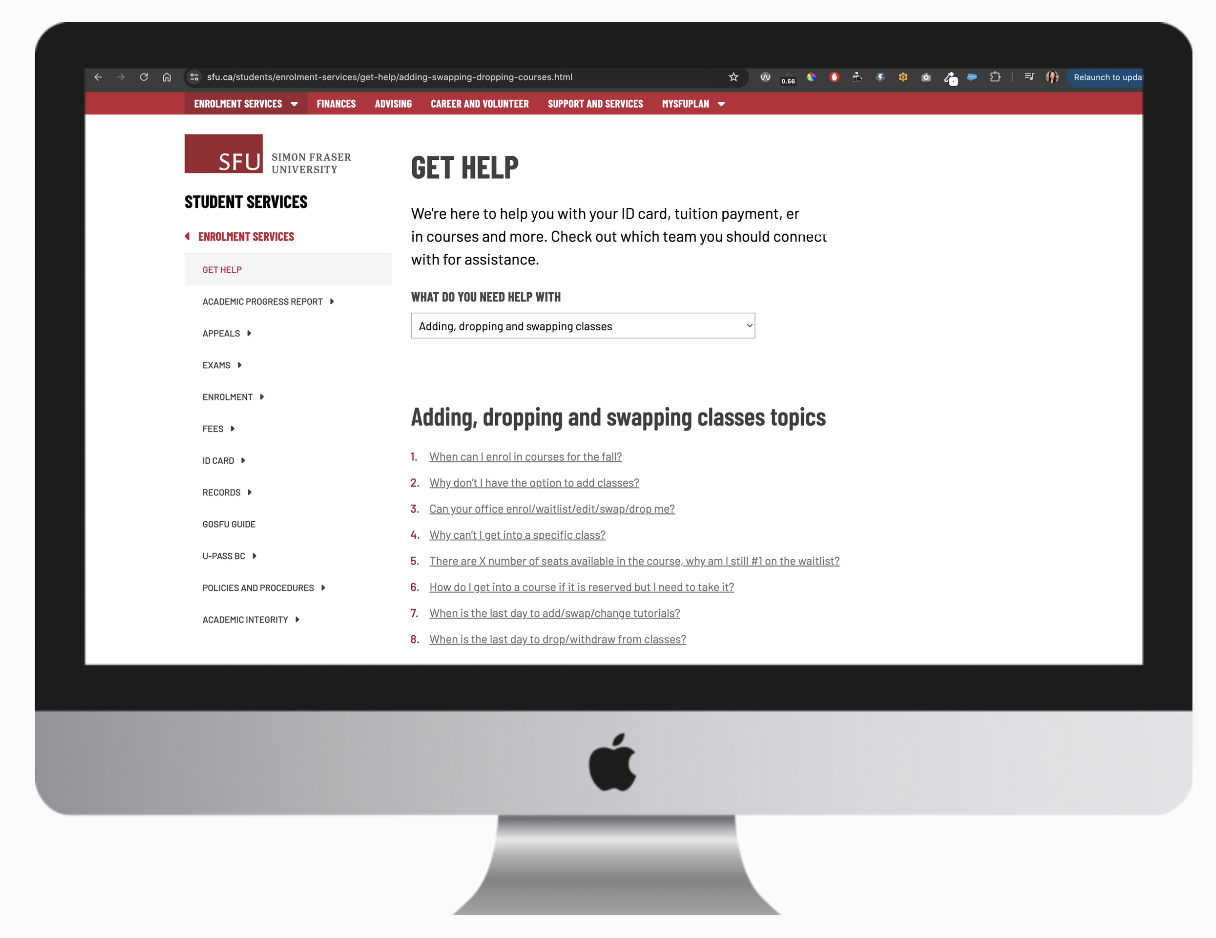
In addition to redesigning these sites, I added and designed a “get help” section that combined both the business units contact information and FAQs into a simple drop down menu. We were also careful with the labelling of these drop down items and opted to labels that were more meaningful to our students.
For instance:
- Enrolment was changed to Adding, dropping, and swapping classes
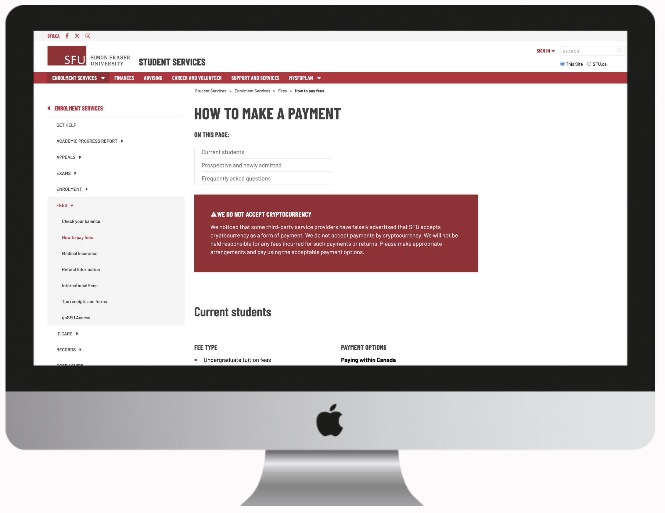
- Finances was changed to Fees, payments and refunds
Results and learnings
The updated sites now appear under one easy to find location and the improved site map was well received by our student facing staff and students. Contact information was easier to locate and students could easily navigate to their topics of choice either by the main landing page, drop down menu, or left hand menu.
Meeting with the business units regularly helped me understand their challenges, which often compromised the web browsing experience. Together, we identified potential improvements and aligned on expectations. As a result, I developed a phased approach to address critical items first, with plans to implement further improvements afterward.
